Pie chart is also known as a circle graph.
Let’s considered the following table which represents the data on the sports liked by several students
| Sport | Number of students |
|---|---|
| Soccer | 25 |
| Volleyball | 20 |
| Baseball | 15 |
In a Pie Chart, the area of the whole circle represents the total number of data.
Consider the circle
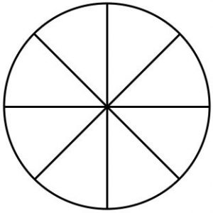
This circle has been divided into 8 equal sectors.
The angle around the center of the circle is 360°
So, the angle around the center in each sector is 1/8 of 360°
Let’s find the angle at the center of the sector 1/8th
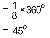
Likewise,
the angle at the center of the sector 5/8th
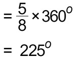
In the above table, the total number of students is 60.
Now let’s find the angle which we can use to represent 1 child. To do that we have to divide 360o by 60.
The angle at the center of a sector denotes one student.
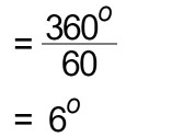
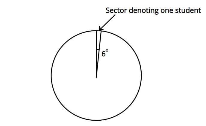
For example, what is the angle of the sector representing 5 students?
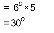
We can take this answer at once by the following method.
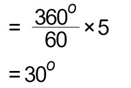
If these steps are difficult for you, you can click on the following link and learn more about Multiplying a Fraction by a Whole Number.
Now let’s try to represent the data given in the table in a pie chart.
By applying the same theory,
The angle at the center of a sector denotes 25 students.
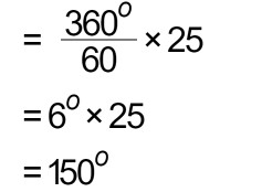
The angle at the center of a sector which denotes 20 students
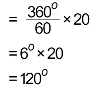
The angle at the center of a sector which denotes 15 students
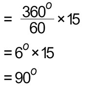
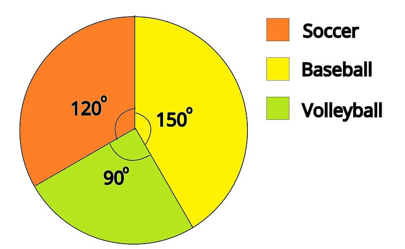
Different colors or patterns should be used to indicate different categories.
Let’s discuss an example.
The following table provides information on the favorite food of students in a primary class.
| Food | Number of Students |
|---|---|
| Cake | 30 |
| Pizza | 15 |
| Hotdog | 20 |
| Ice Cream | 25 |
First, you have to find the total number of data.
30 + 15 + 20 + 25 = 90
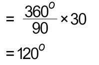
The angle which represents the number of students who likes cake,
The angle which represents the number of students who likes pizza,
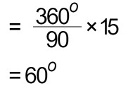
The angle which represents the number of students who likes hotdogs,
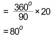
The angle which represents the number of students who likes ice cream,
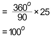
Hint :
If your answers are correct, sum of all angles should be equal to 360o .
120o + 60o + 80o + 100o = 360o
Let’s draw the pie chart.
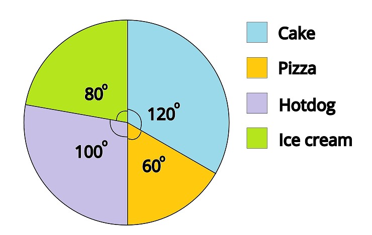
Exercise
Represent the given data in a pie chart.
| Type | Number of vehicles |
|---|---|
| Car | 28 |
| SUV | 14 |
| Bus | 10 |
| Truck | 25 |
| Bicycle | 5 |
Interpretation of Data Using Pie Charts
Let’s see an example.
The following pie chart represents the harvest obtained by a farmer in kilograms.
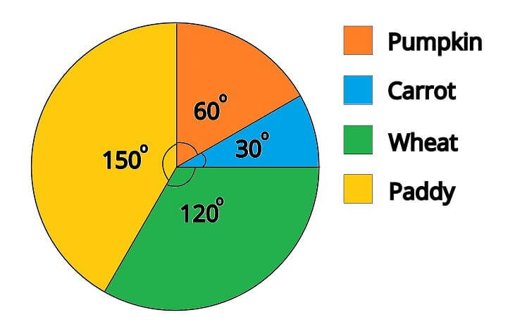
If this farmer received 12000 kg of pumpkin as his harvest. Find the answers to the following questions.
a) What was the harvest he obtained by cultivating carrots?
At this stage, we have to find how much data is represented by 1o in the pie chart. To do that we have to follow through with what we know.
We know that the pumpkin harvest is 12000 kg and to represent the pumpkin harvest we use 60o from the pie chart.
That means by 60o it represents 12000 kg.
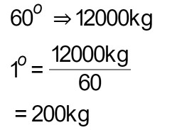
Now we know that 1o denotes 200 kg from the harvest.
Now let’s find the answer to our question.
Harvest obtained by cultivating carrots is,
= angle used to indicate carrot harvest x harvest indicate from 1o
= 30 x 200 kg
= 6000 kg
b) what is the harvest he obtained by cultivating paddy?
= 150 x 200 kg
= 30000 kg
c) what is the difference between the harvest of paddy cultivation and wheat cultivation?
From the above question, we know the harvest of paddy cultivation. Now we have to find the harvest of wheat.
= 120 x 200
= 24000 kg
Now the difference is,
= 30000 kg – 24000 kg
= 6000 kg

Pingback: How to Make a Pie Chart in Google Sheets | Math Tutor