Before we discuss how to make a pie chart in google sheets, Let’s see what is a pie graph.
A pie chart is a statistical graphic that shows a numerical proportion using a circular design. The slices are equal in size and each slice’s arc length is proportional to the quantity represented. Statistical charts are a great way to display quantitative information, but the most common types of pie charts are bar charts, scatter plots, and line graphs. For more details, read on. Listed below are a few examples.
First, make sure that the slices are sized correctly. The slices should be half the circle. This makes them easier for readers to read. The pie chart below is a good example. It shows how many native English speakers are in the United States. It is important to note that the number of non-native English speakers is smaller in the United States than it is in the United Kingdom. This means that a slice of pie can be easily understood, but a larger slice may be harder to read.
In a pie chart, the slices should be adjacent to each other or exploding. This is useful for comparing different groups. It’s important to remember that pie slices cannot be pulled out one by one. This is why you can use other plots to compare different groups. However, you should remember that pie charts are best viewed one at a time. If you need to compare a single slice to several, it is best to create different charts.
Google Pie Chart
A Google pie chart maker is an easy way to display percentages. It is a useful tool to present percentages and other graphical data. The pie chart can be customized in many ways. For instance, you can use any font, color, and size for the title, subtitle, and legend. You can also change the style of the label, legend, and the slice itself. Then, just insert the data range that you want to display.
How to Make a Pie Chart in Google Sheets
First, you have to go to the https://sheets.google.com
Select a Blank sheet or open your document from the list.

It will open your new sheet or your existing document.
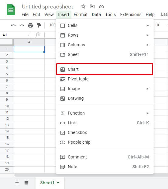
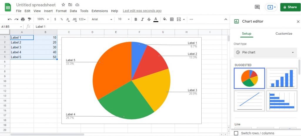
Now go to the Insert in the main menu and select Chart.
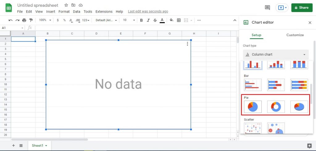
It will open a new section, Chart editor on the left side of the page.
Scroll down the section and search for the Pie Chart category.
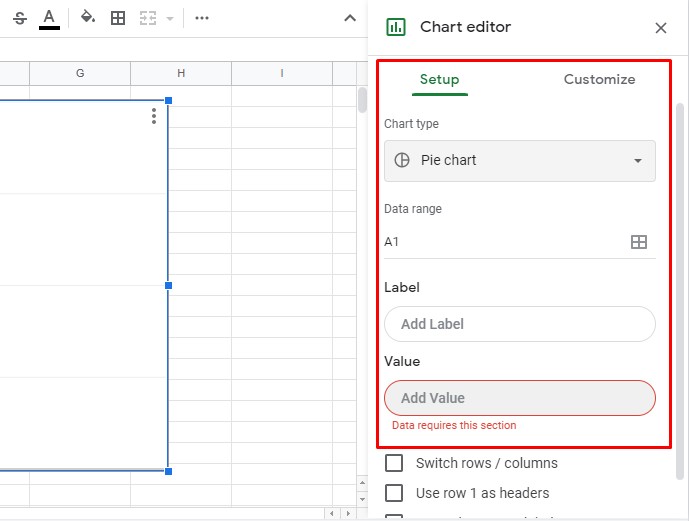
You can insert the data range by the cell addresses and customize the pie chart from the chart editor customize tab.
But, there is a straightforward way to create a pie chart with given data.
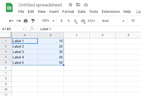
For that, you have to insert data into the cells before you go to the chart editor.
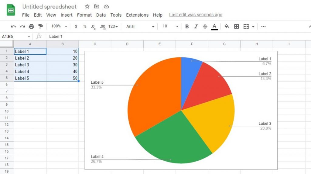
Select the data range you want to create the pie chart.
Now go to the Insert > Chart
It will automatically create a pie chart according to your data. Make sure your data type same as the above image example.
Now you have successfully created the pie chart. Also, Google sheets will suggest to you what other chart types you can create with the data you have inserted.
You can edit the labels and data easily by editing the data table.
That is how to make a pie chart in google forms.